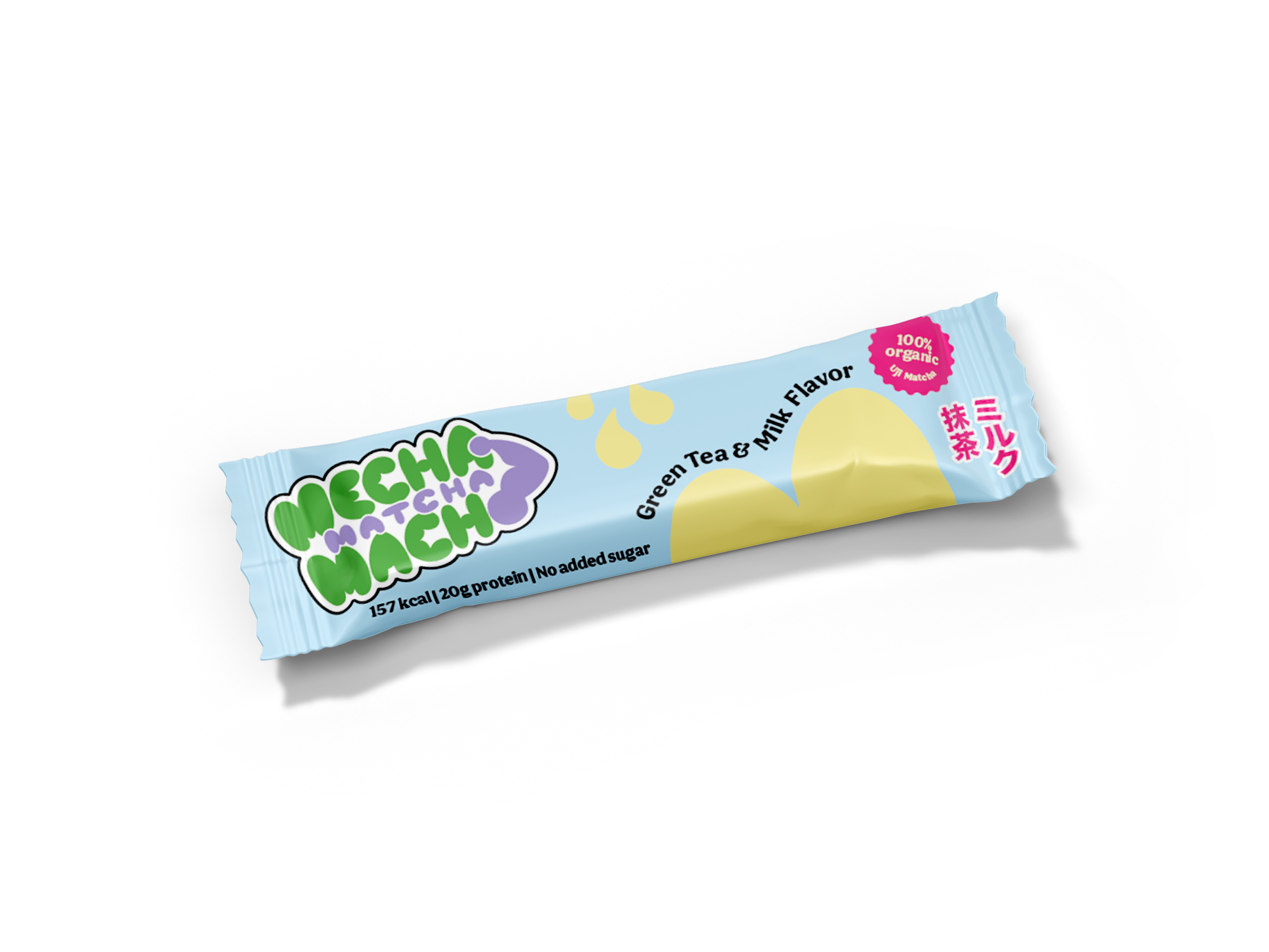
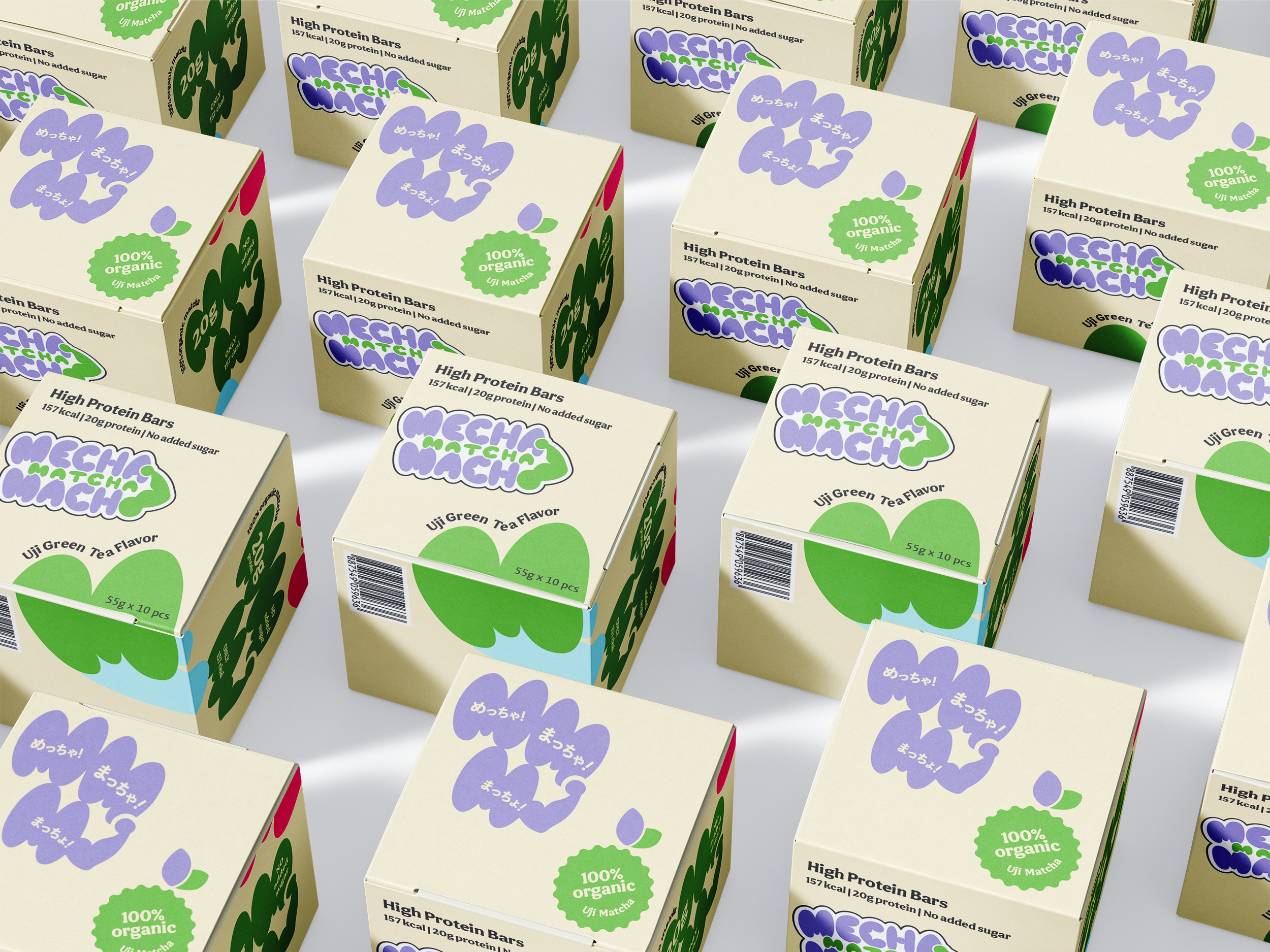
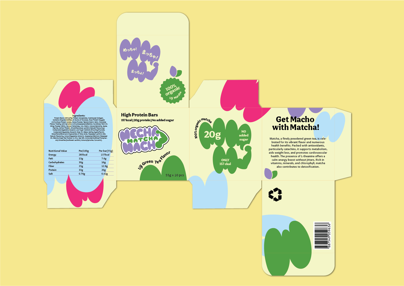
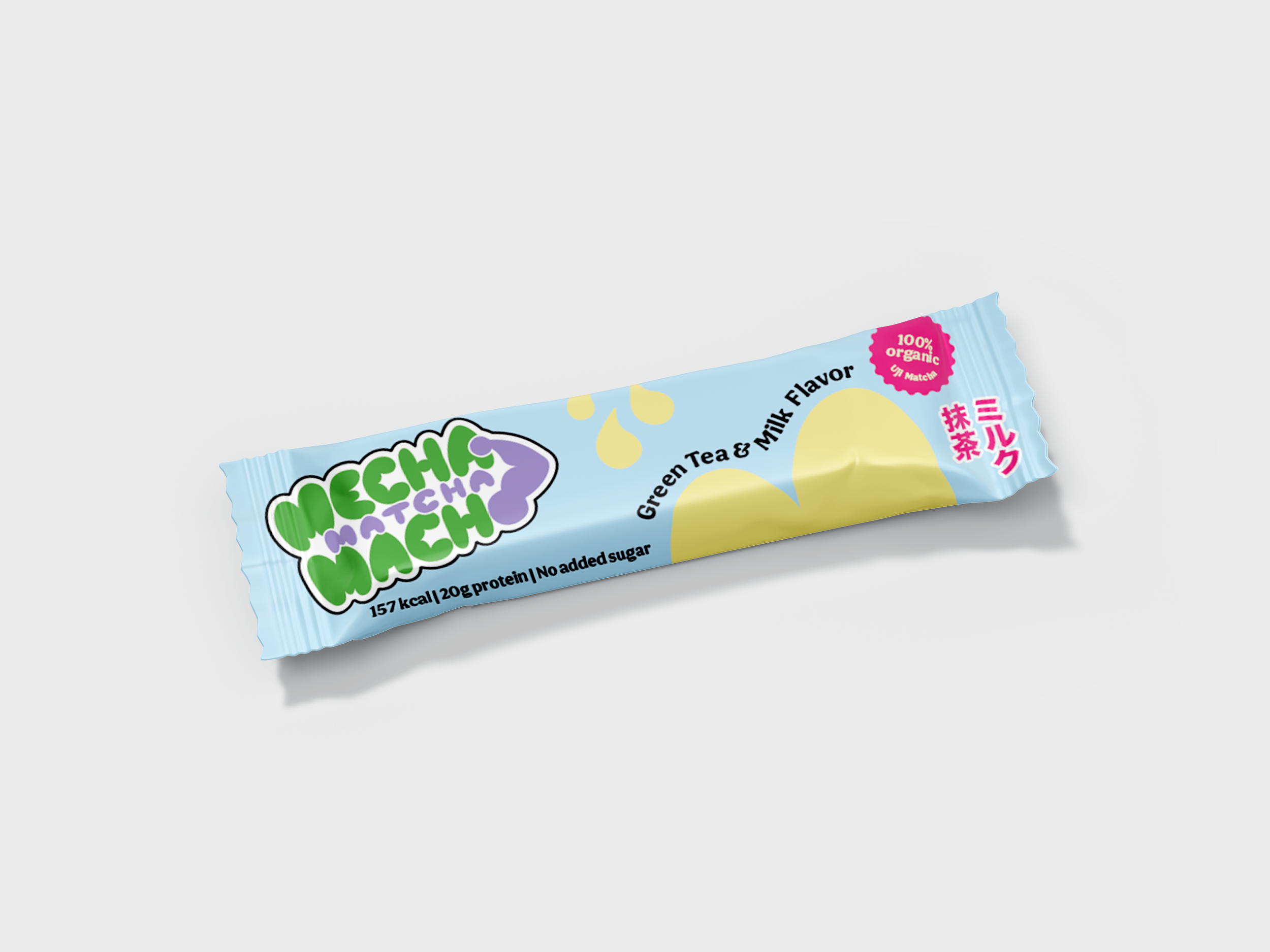
MECHA MATCHA MACHO
- Not for the ”gym bro” clientele

About the project
The name "Mecha Matcha Macho" plays on words, incorporating both Japanese and English terms commonly used in Japan. "Mecha" translates to "Very" in Japanese, while "Matcha" is the Japanese term for green tea. Lastly, "Macho," akin to its English counterpart, describes someone with a muscular physique.
For the brand's key colour, I opted for a vibrant Matcha green, complemented by a selection of bold, bright colours. The logo features a soft and bubbly font, with a playful twist—a muscular arm replaces the "O" in Macho, stretching up to connect with the "A" in Mecha. This unique design element imparts a quirky, cartoonish impression on the logo, reflecting the brand's distinctive character.