
Marx Memorial Library
- Rebrand
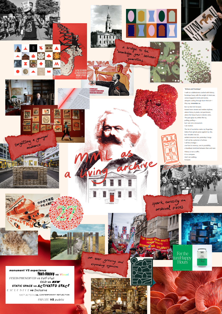
A living archive for all
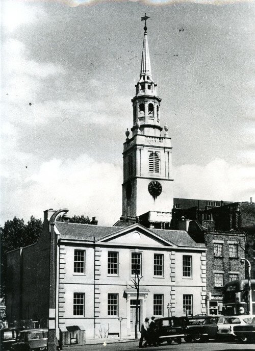
As part of the team, I worked on this project to pitch a 360 rebrand for the library and archive Marx Memorial Library and Workers' School, located in Clerkenwell in central London.
Award Winning Design
1st place in design pitch contest for the rebranding of Marx Memorial Library and Workers’ School for the most practical design solution.

My Role
Re-branding & Conceptualising
Motion Graphic Design
Social Media Rebranding

This project was a joint effort of our team of six; İlayda Karagöz, Connor Pearce, Zikki Xie, Max Von Holtum, Nilay Sen and I, Elvira Vikström
What is MML?
One of the core issues we identified was the lack of a clear identity. Was it a library, a school, or a museum? Everyone we spoke to had a different interpretation, resulting in confusion and inconsistency.
To address this, we had to redefine what the MML represented. We decided to approach it as a living archive: an evergrowing, ever-evolving space that held rich history.
This new direction became the foundation for all our design decisions.
The Living Archive
We wanted to incoporate the idea of the living archive all throughout our branding. We played around with dynamic shapes, fonts and later, motion graphics.
We wanted every bit of the branding, down to the font choices, to feel like it was growing and breathing.

Lack of Manpower
One key consideration we kept in mind throughout the entire design process was the MML’s lack of manpower.
With only three full-time staff members and a small group of volunteers, we had to be realistic about what could be maintained in the long run.
We focused on interaction ideas that not only required no additional manpower, it also sought to reduce the workload on existing staff
Modernising, without
Alienating
Another important consideration in our project was how to rebrand the MML in a way that feels modern and engaging to younger audiences, without alienating its older supporters.
The MML deals with weighty, often complex topics, which meant that an overly playful tone would have been inappropriate and potentially disrespectful.


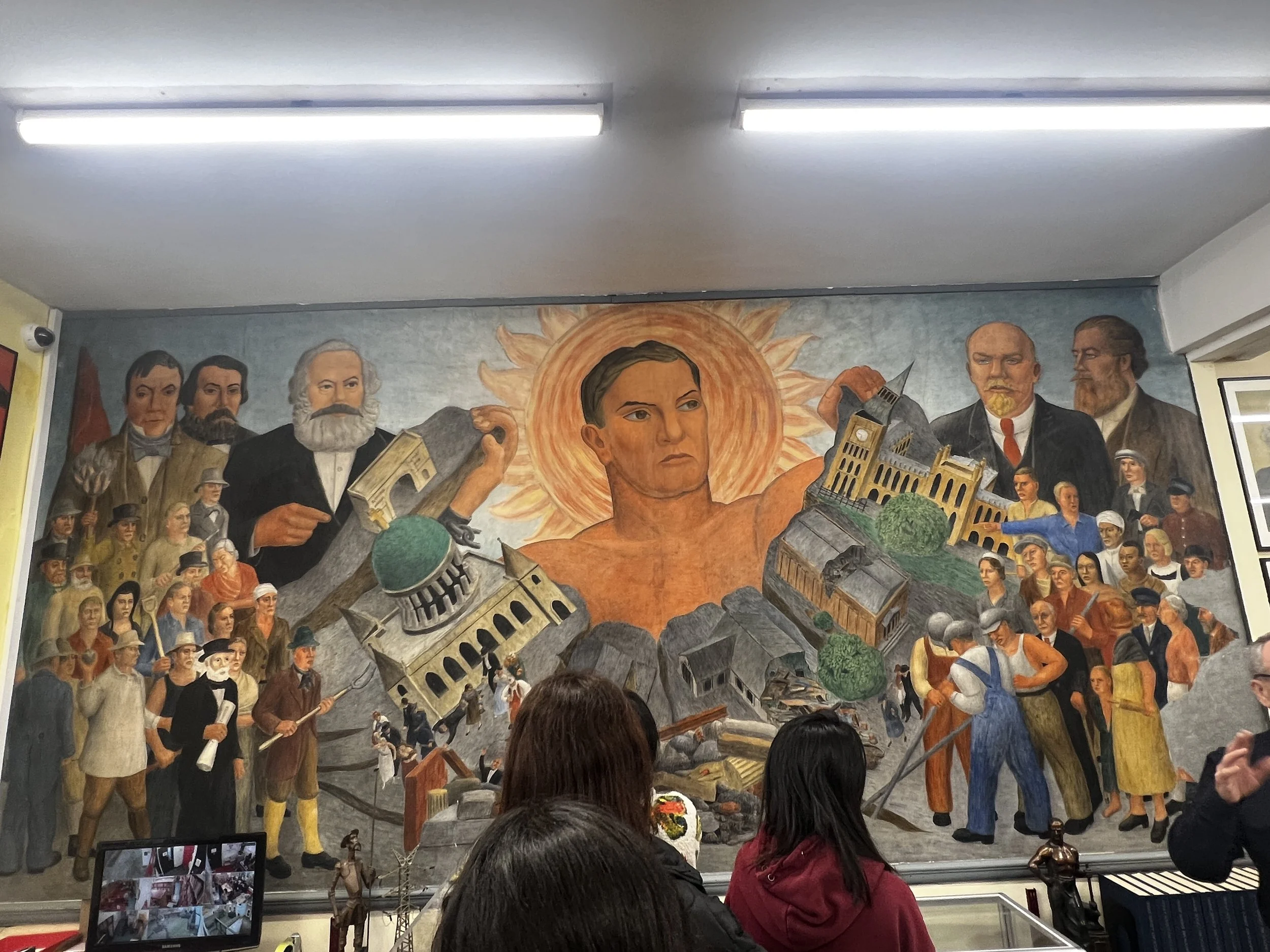
Radical Clerkenwell
& Lenin’s Office
We wanted to challenge and shift the common perception of the Marx Memorial Library as simply a space dedicated to Karl Marx, communism, and Marxist ideology.
We wanted people to visit because of the rich, multifaceted history held within its walls and out on its streets, regardless of their political leanings.


By broadening the narrative, we hoped to make the MML more approachable to a wider audience and not just those with prior interest in communism or socialist theory.
Visual Branding &
Identity
Problem Faced:
Incohesive Visual Branding & Identity
Unsystematic Social Media Presence
Undefined Brand Guideline
The different logos and colours that MML currently uses for its website and print media were having a negative impact on it’s cohesive visual identity.
With the colour combinations, we aim for our visual language to shine and stand out.
To us, bright red represents a strong and independent ideology. The combination of this primary colour with contrasting colours such as black, green, and lilac allowed us to carry the impact of Marxism into the renewed visual language.
By setting the rules of colour usage within the brand guideline, it’s also creating a clear path to follow for further applications for MML to have a cohesive visual language.
Since we wanted to reimagine MML in its strong suit, we wanted to make a bold visual stain by adding ‘the dot’. The dot also represents the decisiveness of the visual language that we aim to create for MML.
We also add the dot as an extra design element and use it as a design tool for our audience. We made it a part of the overall branding by using it in different media. For example, in the menu tab on the website and in the gradient motion intros we prepared for social media.

Why the full stop?

We made it our priority for the logo we wanted to create to have a strong image and expression, and to be at a level that could be considered a brand in its own right.
That is why we wanted to create a logo that embraces its strong ideology & meaning and proceed to create a branding with an unexpected, out-of-the-ordinary approach.
Just like the V&A, we decided to refer Marx Memorial Library as MMLand create a brand image around it to accompany our logotype.
Also, by having the logomark, we had a playground within the visual world we create.

We chose a sans-serif typeface, ‘Larsseit’, to give information through our design. To accompany that, we continue with a monotype font, ‘Antikor Mono,’ that fits with the archival presence of MML.
We also use ‘FF Blur’ on the website landing page as a display font, but since this is the foundation font of our logotype, we did not want to overuse it through our visual identity and take away the uniqueness of the renewed logotype.
For the overall typography look, we aimed to go beyond the archive system that is in people's minds and address it in a modern way.
Motion Graphics
We decided to implement motion graphics throughout our designs to reflect our “living archive” concept and how the archive is ever-growing.
Animations including the logo, monogram, and social media elements — adding organic, erratic movements to express growth and change.

For the website landing page, we created an eye-catching animation that tells the story of our reimagined vision, using organic movement to reflect a living organism.
To avoid alienating existing users, based on feedback, the animation starts with the original logo, which slowly “melts” into the new logo before fading into the homepage.

Social Media
Presence & Design
Problem Faced:
Unsystematic Social Media Presence
Weaknesses of the Audience Engagement
Cohesiveness Between Different Social Media
MML’s current Instagram profile became clear that while there was an effort to share content, little thought had gone into how it was presented. Posts appeared cluttered and amateurish—unlikely to attract or engage newcomers.
We wanted our solution to be not only visually appealing but also practical and realistic for the client to implement. With this in mind, we developed a clear structure and set of guidelines tailored specifically for MML’s social media use, such as a colour coding system and using grayscale/duotone visuals. We introduced defined content categories and an easy-to-follow system that would simplify the posting process for their staff.
We aimed to ensure the templates were accessible and manageable—even for team members with limited experience using design software.

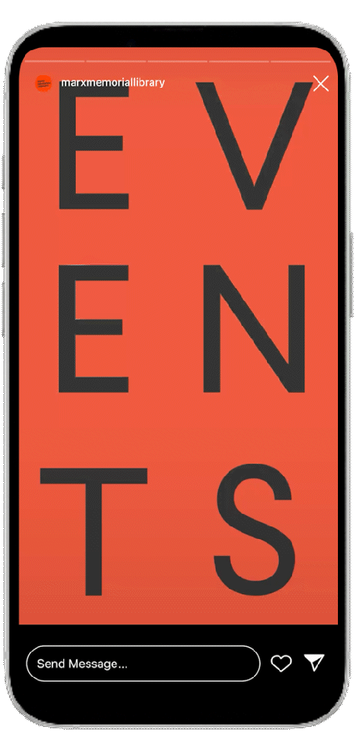
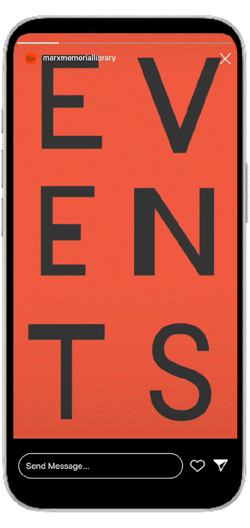
We created an ‘Events’ category to better inform visitors of what is happening at MML.
The series will be posted to stories but saved to highlights so that the schedule can be viewed even after the stories have expired.


This Instagram story series, using motion graphics and our statement dot, is a suggestion on how to interact with the audience online and raise interest as well as awareness in the wide range of the archive.
Website & Illustrations
The purpose of an online platform like a website is to make the mission of the institution more accessible.
The existing MML website lacked a cohesive brand language matching with no print, social media or on-location branding.
We have created a website to match our brand guideline; incorporating color palettes, typography and visual styles for consistency across our digital platform.
The website contains all necessary information, in an accessible way, as well as options to support MML financially, attend events and retained all necessary information concerning the archives held at MML
The website begins with Lenin’s office, which we believe is an important historical space that is not being optimized to expand MML’s target audience.

Images follow a consistent style of illustration, duotone or greyscale, to avoid copyright issues with archival material and to follow a consistent style throughout the site.
Additionally, these effects are easy to recreate in software that MML are familiar with for any updates, revisions or further changes MML may want to make to the website.


Read the QR code to watch website prototype video.


Two viewing modes for legibility ↑↓


We created a set of illustrations that support the content without overwhelming it—helping to make the digital materials feel more approachable while still respecting the historical and political significance of the Marx Memorial Library.


To maintain visual consistency and avoid potential copyright issues, we decided to produce original illustrations for both the website and the newsletter. This approach allowed us to tailor the visuals specifically to the tone and purpose of the project.
Digital Archive System
Problem Faced:
Lack of Manpower
Preserving Fragile Artefacts
Limited Physical Engagement in MML
As a way to increase engagement for the targeted age group, we devised an archive system that can allow visitors to flip through the materials without needing a staff member to prepare it for them.
The materials are sorted into their tags, allowing visitors to find what they want easily or discover new stories - while also protecting original artifacts from excessive handling.
Read the QR code to watch archive prototype video.


Instant Access — Visitors can explore archive details with a click and request physical copies directly from MML if needed.
Fragile Artefacts — Important historical artefacts are placed in plastic folders and requires a staff to prepare for viewing.
Hologram Room Experience
Problem Targeted:
Limited Physical Engagement in MML
Difficulty connecting with non-specialist or younger
visitorsLack of Manpower
We propose transforming Lenin’s Room into an interactive space using hologram projection. Visitors would see Lenin writing Iskra in real-time, bringing history to life and creating an immersive, memorable experience — especially for younger, experience-driven audiences.
This would also help to engage a different demographic beyond MML’s traditional audience through a more dynamic, story-driven interaction.

Read the QR code to watch the hologram prototype video.

Live Translation — Visitors see original Russian text transform seamlessly into English, preserving authenticity while ensuring accessibility for all audiences.
Newsletter
One of the key problems we identified in the previous Marx Memorial Library newsletter was the lack of a unified design language abd consistent layout. The overall visual identity felt fragmented, and the content itself was limited in both depth and clarity.
To address these issues, we designed a new version of the newsletter that introduces a more cohesive visual style. Alongside the visual updated, we also worked on expanding the content to make the newsletter more engaging and informative for its readers.


