Pro Prio

An app to educate and support.

The app request originated from a global pharmaceutical giant, focusing on developing a platform for patients recently diagnosed with liver cancer. The goal was to provide a space for patients and their loved ones to learn more about the diagnosis, available treatments, and navigating life with this disease.

Structured as a pitch competition within the client’s organisation, teams were formed, each collaborating with a creative agency. This specific design was one of two presented as our contribution. As the main designer, I conceptualized the design, layouts, and some features, collaborating with a copywriter and an art director to refine the designs. Due to copyright considerations, I subsequently redesigned the project for my online portfolio. Which is what I’m presenting here.

My Role

App Design
Journey Mapping
Information Architecture
Wireframing
Universal Design
Mobile phone screen displaying ProPrio app with a blue logo and mission statement. Sections include information about Xyz and family diagnosis, with navigation buttons labeled Diagnosis, Treatments, Lifestyle, and Home at the bottom.
Collection of medical information pages and a smartphone displaying a healthcare app, focused on diagnostics and treatments.
A person in scrubs holding hands with an older man inside a well-lit room.
A young woman and an elderly woman look at a smartphone together in a bright living room.
Wooden blocks with icons representing healthcare, hospital, disability assistance, and environmental care, with a person's hand adjusting a block featuring a heart and a person inside.

Easy to use and understand

Process & Thoughts

In navigating the guidelines and adhering to the specified requirements, I aimed to develop a design that would be easily comprehensible and navigable, especially for an audience less accustomed to apps and smartphone usage. This involved extensive research and trials, delving into the intricacies of UI/UX design. Additionally, I revisited the fundamentals of graphic design, focusing on establishing hierarchies and considering how to organise a substantial amount of information. To prevent overwhelming the user, I incorporated the principle of progressive disclosure.
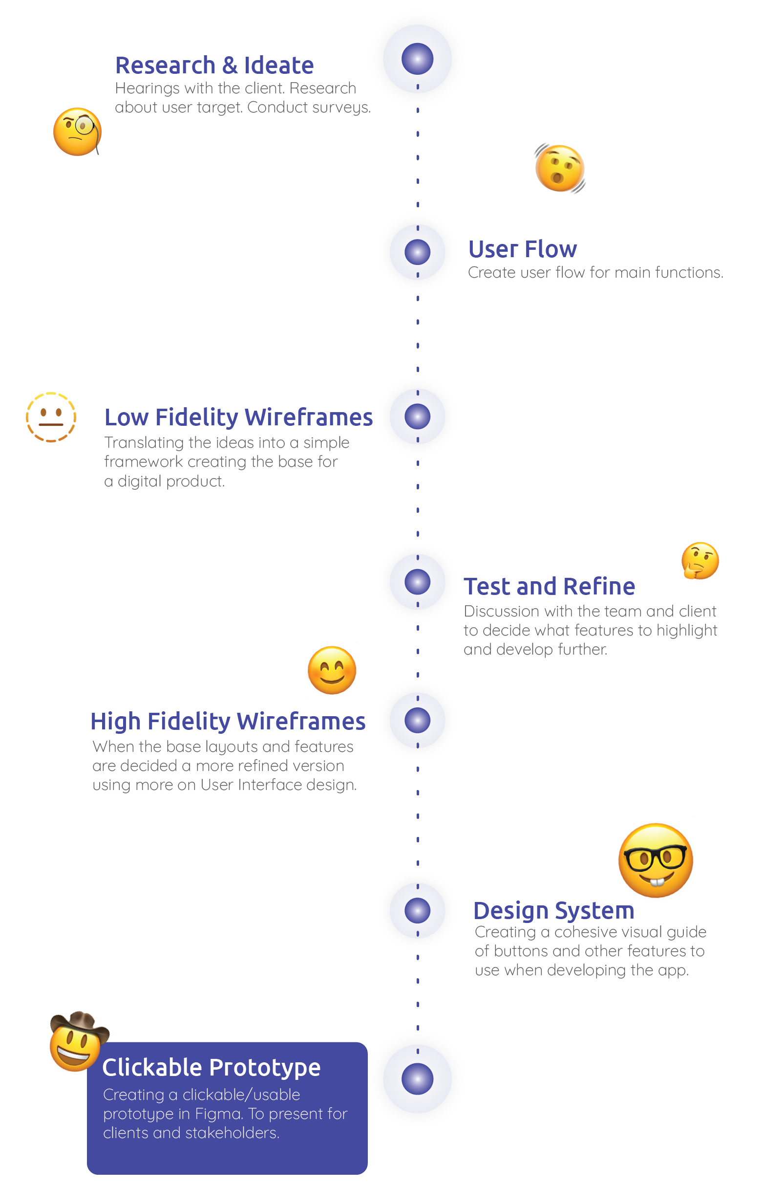
Flowchart illustrating the process of creating a clickable prototype in Figma, with various emojis representing different steps and stages.
A flowchart with categories such as Home / Landing, All Profiles, Treatments, Diagnosis, and Life (style). Subcategories include various profiles and patient stories, with some sections highlighted in yellow and others in white or light blue.
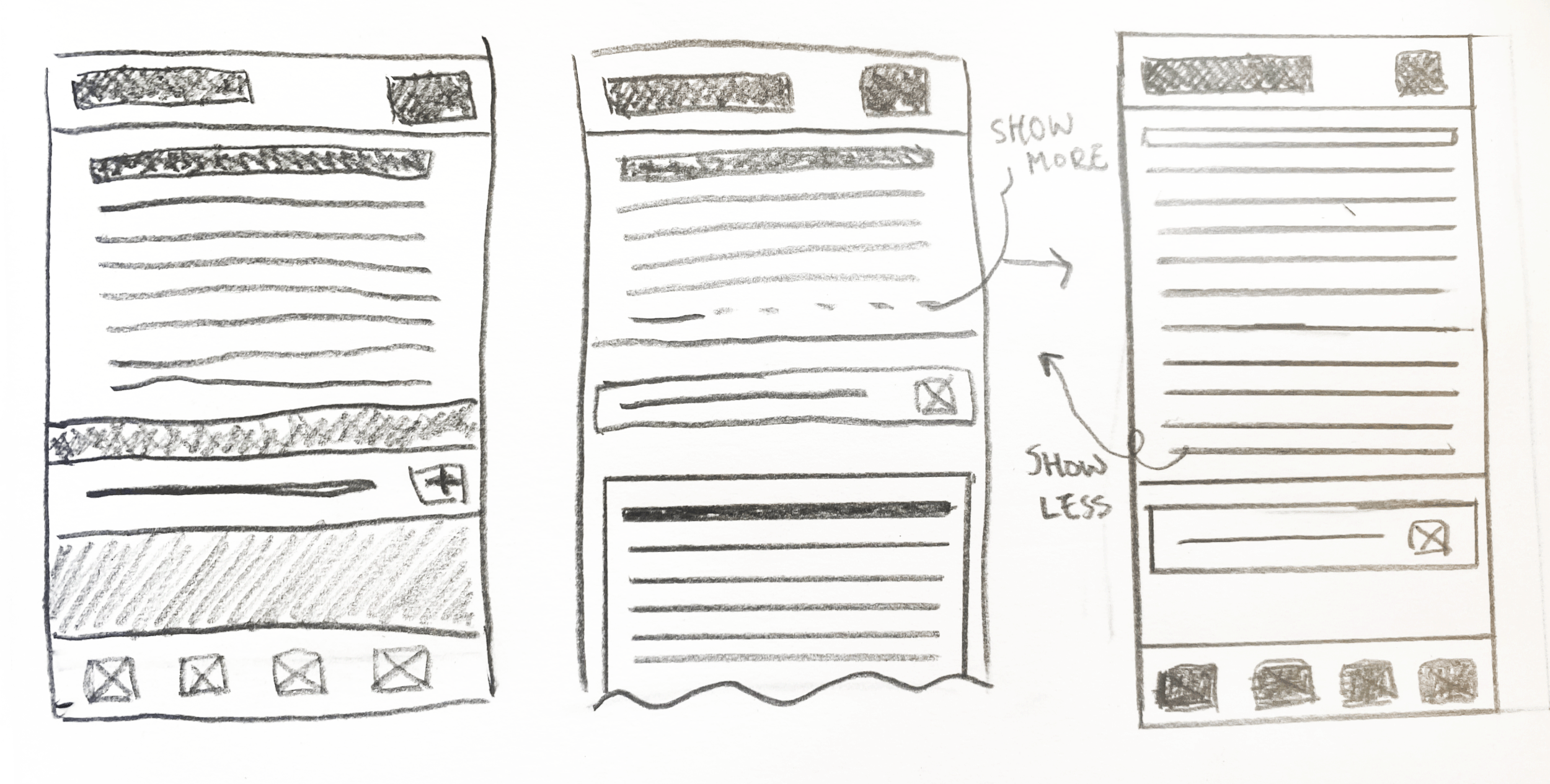
Hand-drawn sketches of three different mobile app interface designs, featuring layouts with headers, text blocks, buttons, and options to show more or less content.
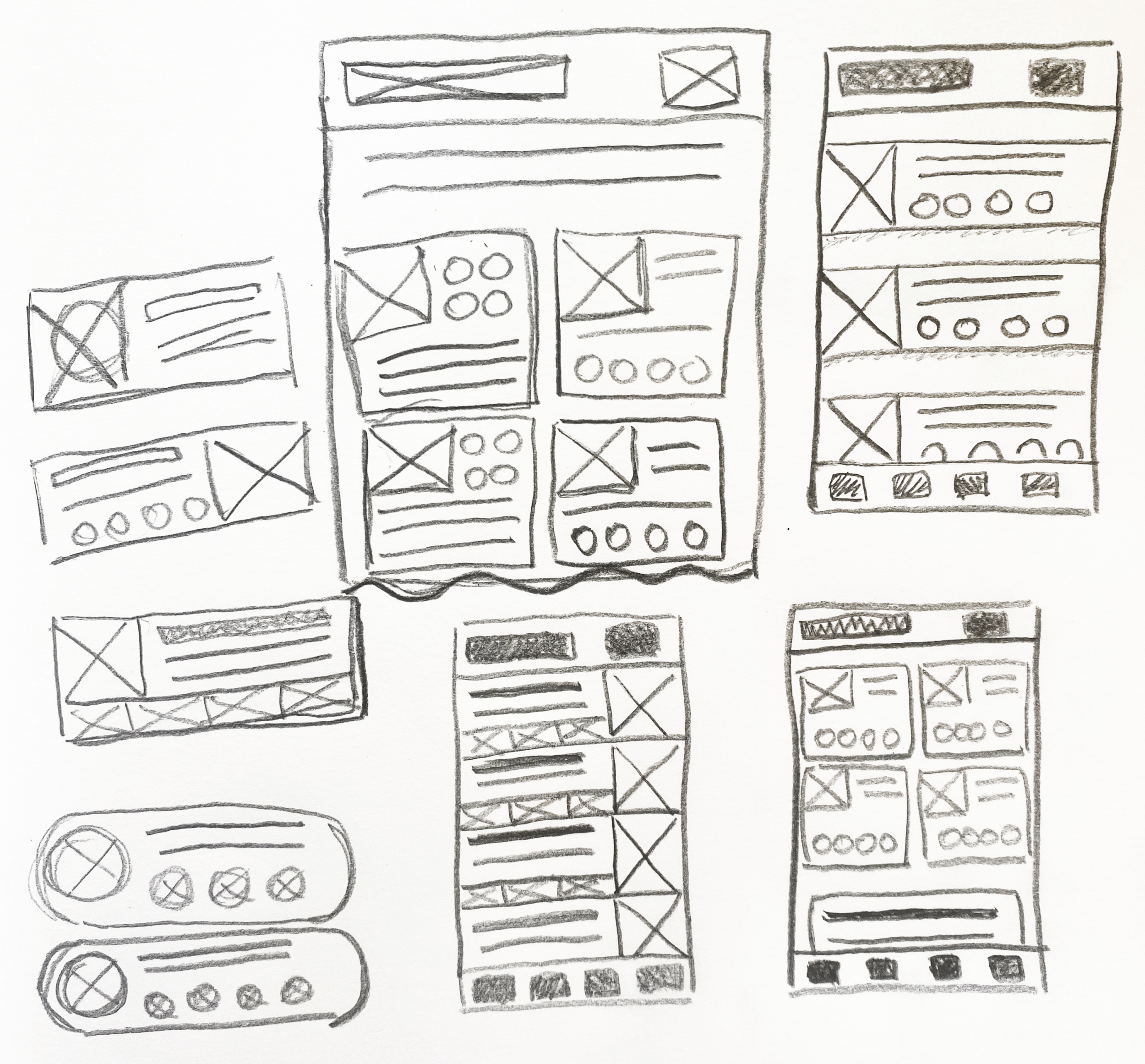
A black and white hand-drawn sketch of multiple mobile phone screen layouts with boxes, lines, circles, and X marks representing design elements.
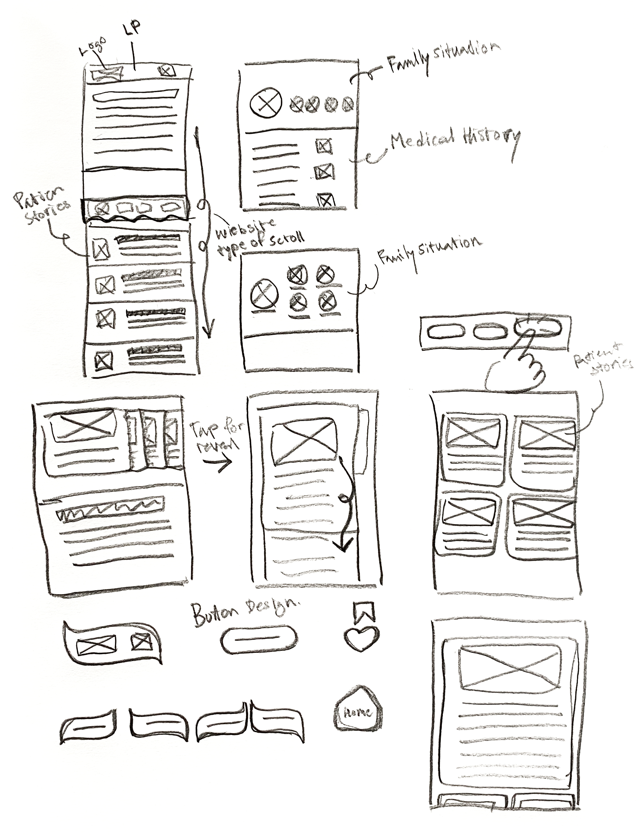
Sketch of a mobile app interface with sections for menu, share options, poll stories, family situation, medical history, photo design, and navigation buttons.

Low Fidelity Wireframes

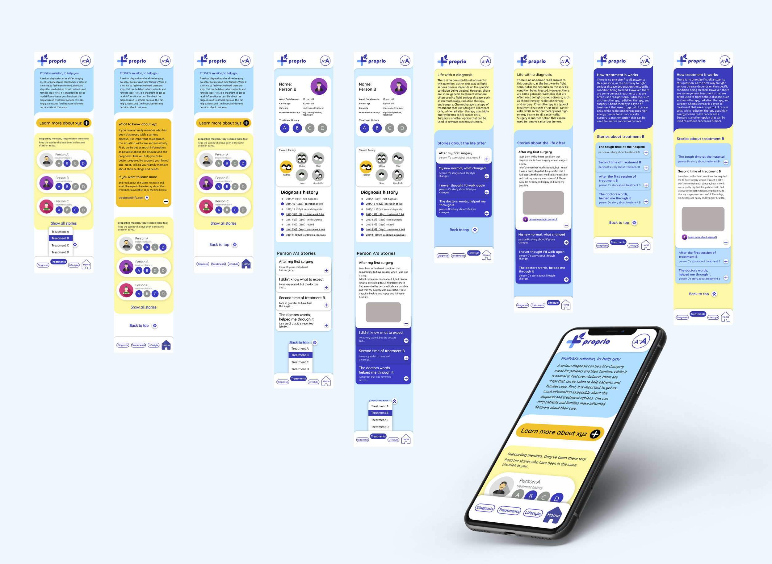
We digitized sketches and created low fidelity wireframes to work out the information architecture of each page.

A series of digital wireframe mockups or prototypes of mobile app screens arranged horizontally against a gradient blue background.

High Fidelity Wireframes

We added fidelity to wireframes with icons and colours to create visual hierarchy and make the app easier to use by adding colour contrasts and fonts of different weights. Throughout the process, I communicated with an art director on my team and the client’s team to make sure the app was heading in the direction they had been meaning to.

A series of mobile app screens related to medical or healthcare information and patient stories, arranged on a yellow background.

Version for the visually impared

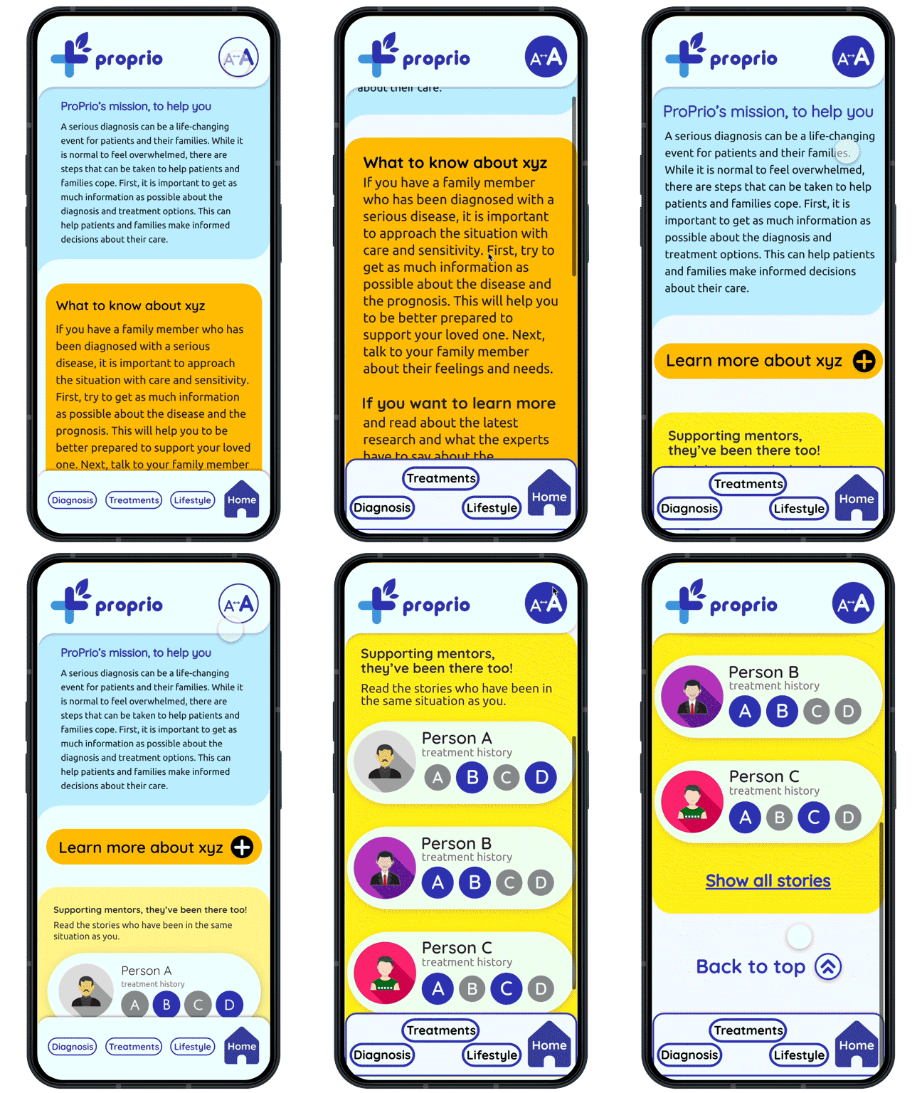
Both versions of the app design, colour scheme, fonts and buttons are made to be easily viewed and used by elders. However, some have more difficulties than others. Therefore, the app has two modes. One “regular view“ and one “easy view” where the colour contrasts have been exaggerated and the text enlarged.

A collection of mobile app interfaces displayed on a blue background, showing charts and stories related to medical diagnoses and treatments.

Final Prototype

I used the software Figma to create a functional app prototype. To show investors and to test design features.
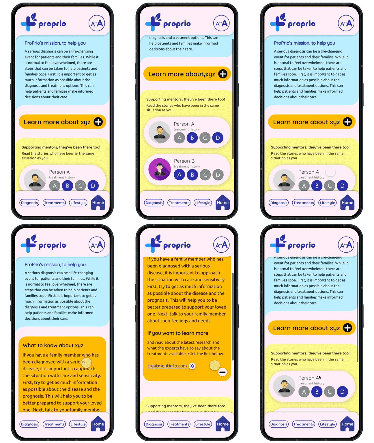
Mobile phone screen displaying the ProPrio app with information about diagnosis, treatments, lifestyle, and a treatment history for Person A, featuring a yellow learn more button, and navigation buttons at the bottom for Diagnosis, Treatments, Lifestyle, and Home.

Progressive Disclosure

As explained in the section above, Progressive disclosure is when you introduce the information gradually in several steps so not to overwhelm the user.
Mobile phone screen showing a healthcare app called 'proprio' with options to learn more about 'xyz', view treatment history for two people, and navigate to Diagnosis, Treatments, Lifestyle, and Home sections.

Profile Lists

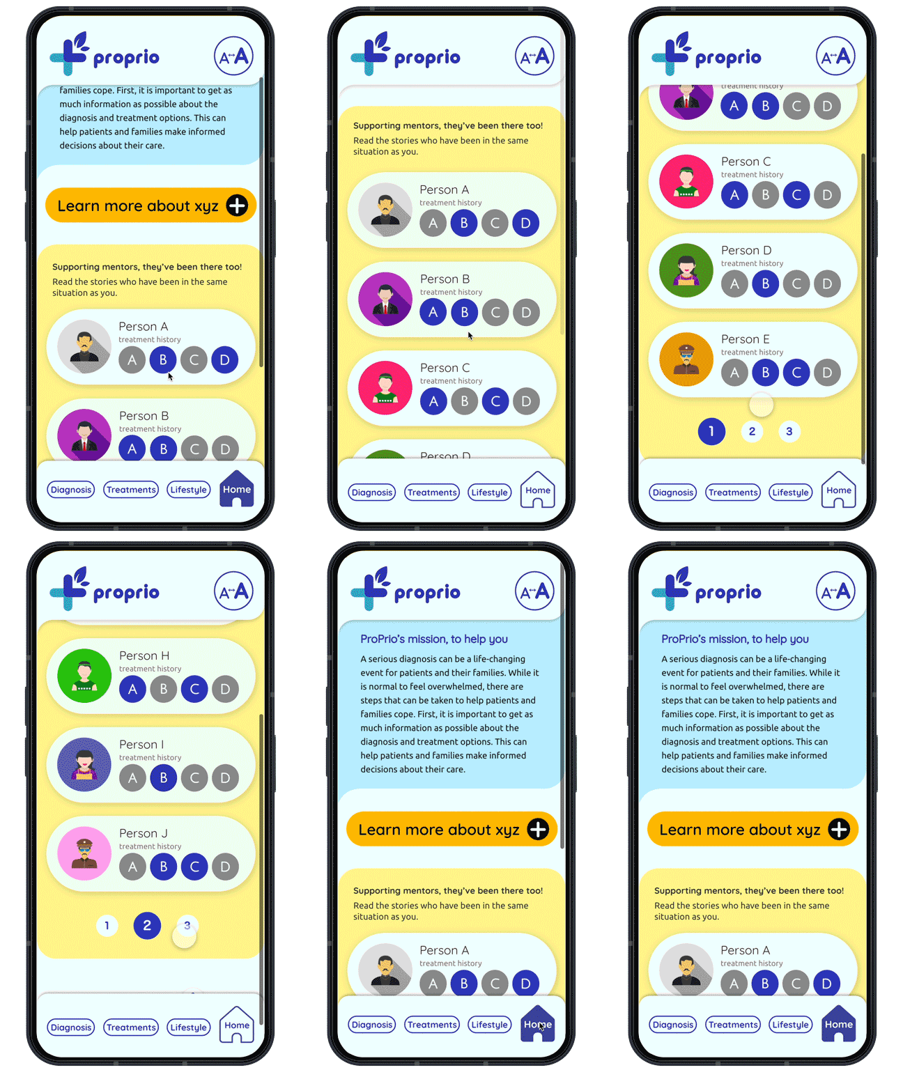
One main purpose of the website is for user to read about other patients who have gone through a similar process. We created these Profile cards where users can see right away what treatments each person has undergone.

When clicking a Profile you will be taken to their specific profile page with a more detailed description of them, their diagnostic and treatment history, and also their blog posts.

Mobile phone displaying an informational webpage about ProPrio, a healthcare organization, with sections on their mission and advice for families with diagnosed members. The webpage features a logo, navigation buttons labeled 'Diagnosis,' 'Treatments,' 'Lifestyle,' and a 'Home' icon.

Universal Design Features

As many of the people diagnosed with liver cancer are older, I wanted to make the app as easy to use for users who might have a visual impairment. I did so by incorporating a button that is always showcased at the top of the page that lets users switch between two viewing modes. One “normal“ mode and one for people who have a condition of sight. It makes the text bigger and uses stronger colour contrasts to make it easier to read the text and to differentiate between the different sections and categories.

The Outcome

Instead of going for a more modern way, going though the different categories, we decided to go for a more traditional website type of layout. So instead of jumping from screen to screen, you will instead scroll up and down the page for longer.

This idea came about because of the target user being older. Instead of introducing something new, it was better to stay to a user experience that the target using would already be used to managing.

A collection of digital health profile cards and a smartphone displaying health information and features, including treatment history, diagnosis history, and options for learning more about medical conditions.
Comparison of two font styles: Quicksand and Ubuntu, showing font weights and character samples.
A screenshot showing text about visual impairments on a webpage, with a yellow background behind some of the text, and additional explanatory text below.
Screen display of a digital interface showing a white article titled 'Incorporating Universal Design Principles and Enhancing Legibility' on the left, with two colored panels on the right showing icons of a circle containing the 'A→A' symbol, and sample user profiles with icons, names, and treatment history. The yellow panel also has a link labeled 'Show all stories' and a blue link labeled 'Show all stories' underneath.
A logo with a plus sign and a leaf, using shades of blue.
A digital screen displaying a document titled 'Incorporating Universal Design Principles and Enhancing Legibility,' with a heading and paragraph text in black on a white background, and a blue icon at the top with a heading A to A arrow.
Comparison of two mobile app screens showing information about supporting mentors and treatment histories of three persons, with a toggle button at the top to change display modes.
Screenshots of a mobile app interface with yellow background, displaying information about serious disease diagnosis, stories of shared experiences, and treatment history of individuals. The interface includes sections with text, icons, and options to navigate and learn more.

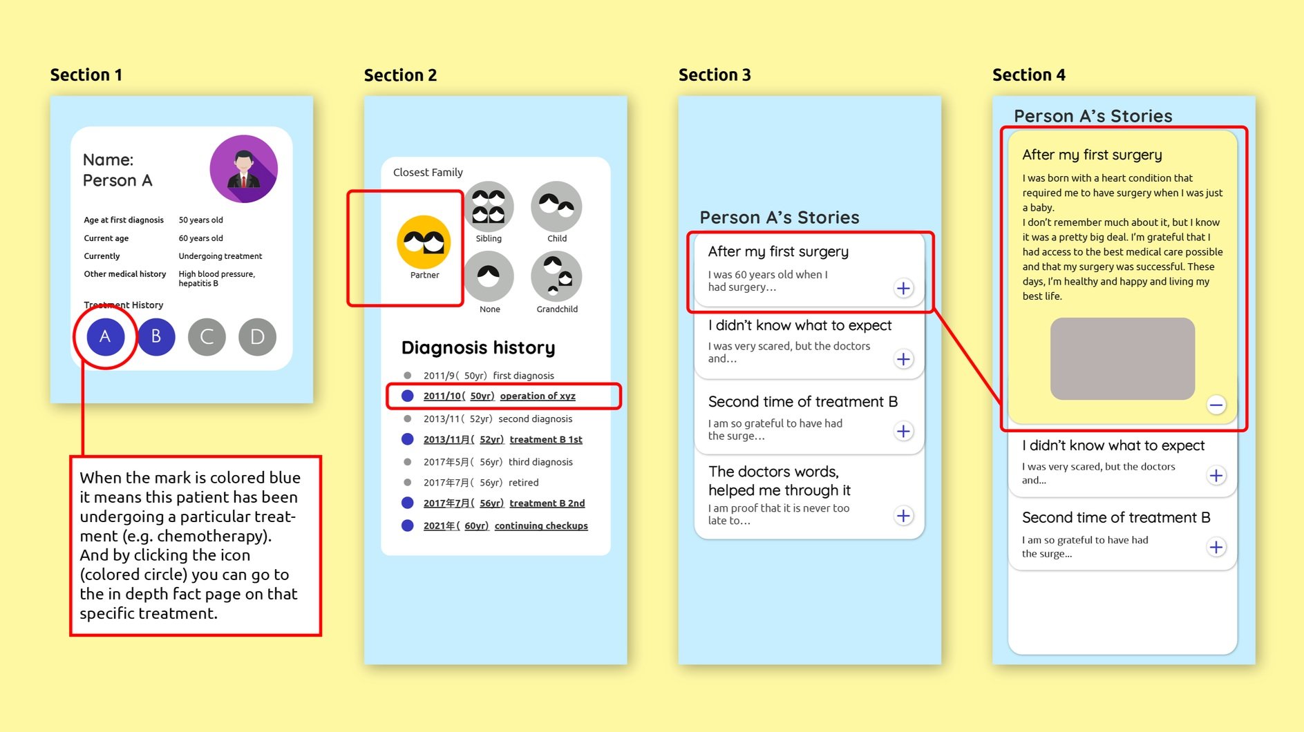
Progressive Disclosure

It is a very useful design technique often implemented in UI/UX design. It’s used to present information in a user-friendly manner, by revealing details gradually, reducing cognitive load and improving user experiences.

Screenshots of a mobile app interface related to medical diagnosis, featuring sections with text about diagnosis and treatment options, profiles of patients with treatment histories, and interactive elements like buttons and links for more information.
A colorful infographic with four sections explaining a medical patient's stories and history. Section 1 shows patient details, including a profile icon and treatment history. Section 2 depicts family relationships and diagnosis history with colored dots. Section 3 displays patient stories about surgery and treatment experiences with expandable text. Section 4 contains a detailed story about the patient's first surgery, with a gray box placeholder and plus/minus icons. The background is yellow, with blue overlays for each section.

Visual Hierarchy

Visual Hierarchy is when different categories of information is grouped together using color, shapes and sizes.

A four-section infographic explaining a medical patient story, including personal details, family relationship icons, diagnosis history, and personal stories about surgery.