MECHA
MATCHA MACHO
- Not for the ”gym bro” clientele
In my pursuit of a healthier lifestyle and muscle gain, I fell into the realm of protein powders. However, I noticed that many of these products were tailored for a specific "Gym bro" clientele, featuring bold and aggressive fonts emphasising product effectiveness and little else.
Recognising a gap in the market, I envisioned a line of protein powders and other protein-enriched products designed for individuals not necessarily engaged in heavy lifting at the gym but still committed to regular workouts and seeking to increase their protein intake.

MY ROLE
This is a personal project that I created and designed myself, from brief to finished mockup product.


Making getting fit a less serious business
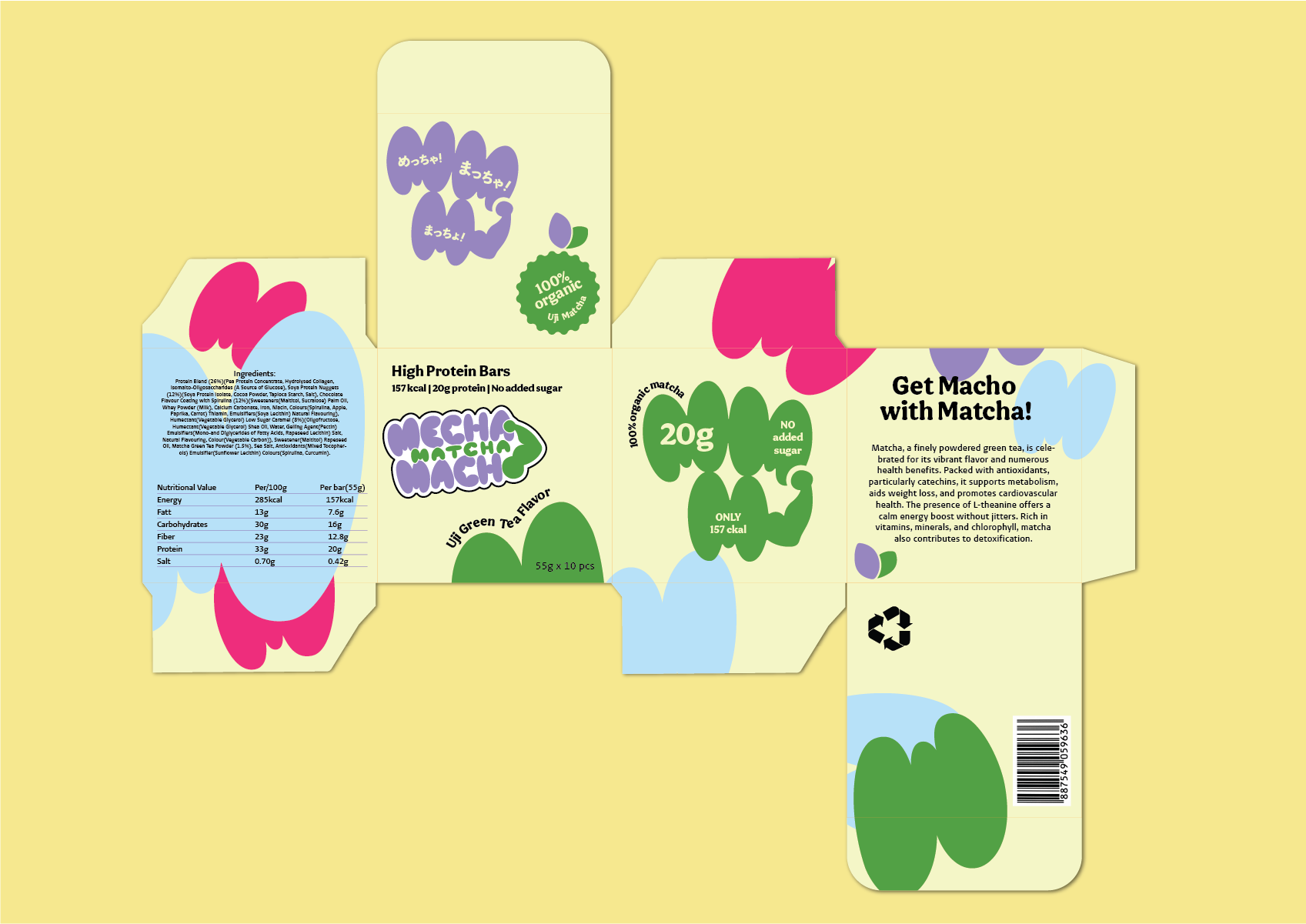
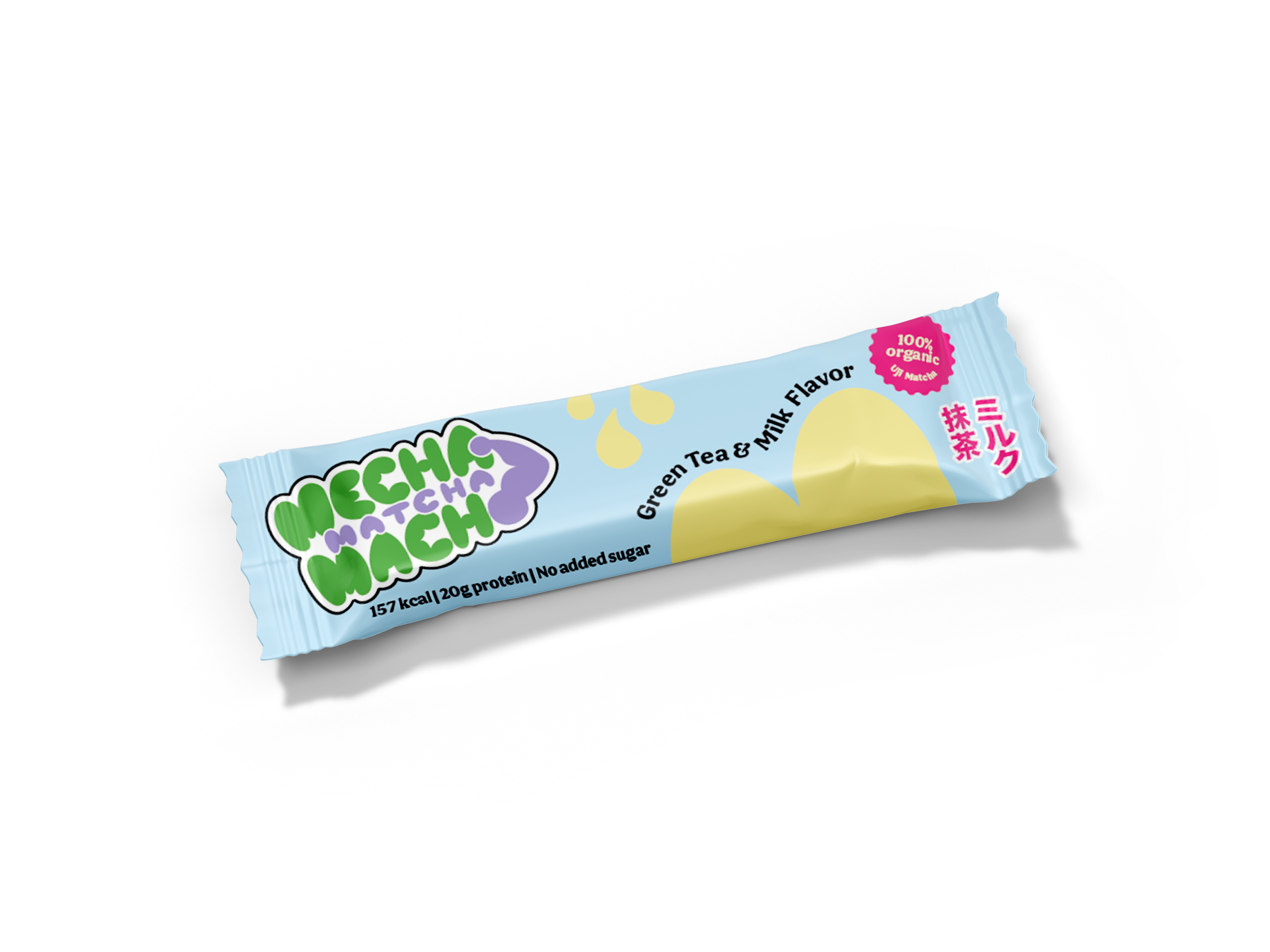
GET MACHO WITH MATCHA

The name "Mecha Matcha Macho" plays on words, incorporating both Japanese and English terms commonly used in Japan. "Mecha" translates to "Very" in Japanese, while "Matcha" is the Japanese term for green tea. Lastly, "Macho," akin to its English counterpart, describes someone with a muscular physique.
For the brand's key colour, I opted for a vibrant Matcha green, complemented by a selection of bold, bright colours. The logo features a soft and bubbly font, with a playful twist—a muscular arm replaces the "O" in Macho, stretching up to connect with the "A" in Mecha. This unique design element imparts a quirky and cartoonish impression to the logo, reflecting the brand's distinctive character.
MOODBOARD

KEYWORDS
Matcha Green
Maximalism
Colorful
Japanese
Poppy
Modern
Cute
Round/Bubbly (text)
Playful


Mainly for a female audience
PROCESS & THOUGHTS
This time, I drew inspiration from Japanese packaging aesthetics and recent Western design trends, known for their vibrant and playful expressions, in contrast to the prevalent corporate minimalism that has been dominant in recent years.
It was my first foray into creating package design, from conceptualisation to the finished mockup. Venturing into this new area required me to shift my approach to design thinking and the process. I closely examined similar products to understand the nuances to consider when crafting a three-dimensional design, especially in the realm of food packaging.

BRAND POSITIONING
& LOGO DESIGN


COLOUR PALETTE


FINAL PRODUCT
Hitting your macros in a funky way

The aim was to design packaging tailored for a predominantly female audience, emphasising both product quality and aesthetic appeal.
Using rounded shapes and soft colours, the packaging conveys a playful and friendly impression, setting it apart from the current market's more utilitarian designs for protein powders and bars.